HyperManual
Lsd
Windows Main
Browser Lsd FAQ's
Menu "Data" Analysis of
Results
This module permits users to analyse the data produced during a
simulation.
See the Introduction, or the window
elements.
Elements of the Analysis of Results window
| List Boxes:
|
Buttons moving list elements
|
| Options
|
Commands
|
Introduction
During a simulation run some of the data produced are stored in memory
(the model configuration indicates which series, Variables or
Parameters,
have to be saved. See the section for Variables
in the main Browser). This data can be accessed by by means of the
Analysis
of Result module, which offers the possibility to observe the data
in a variety of formats. The Analysis of Result module is
activated
in four different cases:
- From the Browser
using
the data produced by the latest simulation, which are stored in memory
until a new simulation run is launched;
- during a debugging
session (button Analysis), when a simulation is
interrupted;
in this case the data are available up to the next to last simulation
step,
and after the analysis of (partial) result the simulation can continue;
- loading the data from a file containing simulation data
previously
saved.
This option is alwasy offered even when a data set is available in
memory
as in the previous two cases.
- Loading data currently stored in the model. These series can be
analysed only at the current time step, that is they are available with
one value.
The window for the Analysis of Result shows the data available
listed in the Series Available
list box. The series to be
elaborated
must be selected and moved in the central list Series Selected:
all the commands concerning plotting, producing statistics or save data
concern only the series in this box. Users can select the options
available
and then issue one of the following commands:
- graphical representations of the series. The series are
plotted
in graphs in different arrangements according to the options chosen
(e.g.
time series or cross section). The graphs are shown in individual
windows
which are listed in the rightmost list box Graphs, and can be
brought
up in the foreground by double-clicking on their title in the list;
- descriptive statistics, either taken over time or
cross-section.
They are printed in the Log window;
- text files, containing in the columns the series
produced. A
variety
of formats are available for export from Lsd, to be subsequently
imported
in an external package for further elaboration;
- postscript files containing the graphical representation
produced
on the windows in a format suitable for inclusion in a word processor.
The user can set a number of options for each of the above operations.
Therefore, each operation is made by the following actions:
- Empty the central list box, if necessary.
- Select the series of interest in the Series Available list
box,
possibly after sorting the available series in a suitable order or
filtering them in a particular way, and
move
them in the central list box Series Selected (button ">").
- Set the options of interest (e.g. automatic scaling, color or no
color
graphs, type of plotting, etc.)
- Issue the command (e.g. plot, statistics etc.)
- If necessary, compare with the model description (e.g. the
equation for
the Variable plotted) available from the menu Help
The module Analysis of Result does not interfere with
the
other activities of a Lsd model program, so that it is possible, for
example,
to analyse the partial results during a simulation and then continue
it.
See the complete description of the elements
available
in the Analysis of Result window.
Series Available
List of the series available. The series are presented in the following
format:
InstallBase 1_11 (30 - 200)
which contains the following information:
- the name of the Variable or Parameter (InstallBase);
- a code to distinguish between the same Variables or Parameters in
different
Objects of the model (1_11).
This
code contains as many digits as the hierarchical level of the Object
containing
the Variable, in the example the first highest level Object and the
eleventh
of the second level. The user can check in the model report, observable
from the menu Help, where the Variable is placed.
- the first and last simulation time step for which the data are
available
(30 - 200). In the example the
Object
containing this Variable has been created in the 30th time step, and
lasted
up to 200th time step.
Sorting series
The order of the series reflects the structure of the model, and
therefore
variables saved from the same Object are listed sequentially. For large
models it may be useful to sort the series available
in one of the available formats.
Selection Methods
From this list variables must be selected to be moved in the list of
the Series Selected. using the Button
'>'.
The labels can be selected using the mouse with the usual bindings:
- click on one label to select it and de-select any other;
- keep the control key pressed and click on a label to add it
to
the
selection without de-selecting other ones.
- click on a selected label to de-select it;
- click and scroll the mouse pointer oevr the listbox to
select all
the labels encountered;
- click on one label, keep the shift key pressed and click on
another
label to select all the labels between the two;
It is possible to select a group of items with the same label, and also
filtering these according to their instance code, using the right
button
of the mouse on one of the labels to select. See help on the batch
selection on this.
Variables' equations
Clicking with the right button of the mouse while keeping the shift
key pressed the system pops up a window showing the code for the
variable.
Note that if the series concern a parameter's value, this operation has
no effect.
Series Selected
This list contains the active series, to be plotted, saved, made
statistics
about. These series have been moved in from the Series Available list
box and pressing the button ">".
The same selection rules as in listbox Series
Available apply. Pressing the button "<" removes
from
this list all the selected labels. Pressing the button Empty
removes all the series in this box, selected or not selected,
equivalent
to select all the labels in this box.
Button ">"
Insert in the listbox Series Selected the variables selected
in the Series Available.
Button "<"
Remove the selected labels from listbox Series Selected.
Buttons concerning Sorting
The labels shown in the Series Available list box are sorted
according to the Object that contain them, starting from the highest
level
Objects to the lowest ones. When there are many series it may is useful
to list all series of the same type together, so to make easier their
selection.
The avaiable sorting criteria are:
- Sort: list the series according to their increasing
label
alphabetical
order and to their code.
- Sort (end): sort the labels according to, firstly, their
increasing
alphabetical label order, and, secondly, then to their "end" date, the
time step when the Object containing the Variable has been removed by
the
model. If no Object has been removed during the simulation, this option
sorts the labels identically to the previous one, Sort. But if
some
Object have been removed, this sorting method shows sequentially the
series
with the same labels placing first the series in Objects still existing.
- Un-sort: reproduce the original order of the series,
with
the ones
contained in the highest Objects first, and then grouped according the
Object containing them.
Button "Clear"
Removes all the labels from the listbox Series Selected.
Equivalent
to select all labels in the listbox and pressing button "<".
Button "Add series"
Add more data series for analysis to the ones currently available,
taken from the current model, from previously saved result files, or
from elaborations of the
selected series.
By default the Analysis of Result
module loads in the Series Available listbox
all the series saved during the latest simulation run (that is the data
contained in variables or parameters marked
to be saved). Besides these data, the user can load three other
types of data to the Analysis of Result
module:
- Data from the current
configuration of the model. These data will conventionally be
marked as data at time step 0, and can be used to make cross-section
graphs or statistics only, since the system can retrieve only the
values of the elements at the current time step. Note that the system
offers a auto-completion facility, so that the window to inser the
label of the desired element is automatically filled in.
- Data loaded from file(s)
of Lsd
results saved from a previous simulation run(s). This option
loads
the data from a files selected with the usual file selection
method. When a file is loaded, its series will be marked by adding a
"F" letter in the end of the label, and the file is assigned an
increasing number, indicated in the Log
window. This file number is also indicated in the first location of the
tag of the series. This convention permits to differentiate from series
produced during the last simulation run, from those data loaded from
the file and, in case, of the different data files loaded. It is
possible to also load several files, usually produced by multiple runs.
- (available only if some series
is present in the Series Selected listbox) Data from creation of new series obtained as
elaboration of the selected series. The system can generate a new
series using the average, minimum, maximum or variance of the selected
series. The user is asked to specify the label of the new variable and
the tag. See here for further details.
Create Series
This option elaborates selected series creating a single new series. The existing
series can be scanned along two dimensions:
- Compute over series: the
new variable will be composed by as many time steps as the selected
ones. Each time step value is computed elaborating the same time step
values of the selected series. For example, (choosing Average) being vtj the value
of series j (with j={1, 2, ...n}) at time t the new series will be computed
as: NewSeriest=SUMj[
vtj
] / n
- Compute over cases: The
new series will be composed by as many time steps as the number of
series selected. Each value is computed elaborating all the values for
one of the series selected across all the time steps of the series. For example, (choosing Average) being vtj the value
of series j at time t the new series will be computed,
for the conventional time step j,
as: NewSeriesj=SUMt[vtj ] / m, where m is the total number of time steps of the series
The new series can be computed as the average, maximum, minimum,
variance, standard deviation (multiplied by a factor) and simple count
of the values in the series. The user must specify a label and a tag, the set of digits used for Lsd
model series used to differentiate for series in different
objects.
It
is possible to filter away data during the elaboration. For example, it
is possible to let the calculation ignore all values below or above a
specified value.
Listbox "Graphs"
List of graphs already created by means of a plot
command. Each graph is linked to one item in this listbox, where they
appear
with the title assigned when created, an increasing counter. Double
clicking
on one of the lines in the list brings the selected graph in the
foreground.
Graphs created directly by gnuplot are reported
in the listbox but are re-created any time their title is
double-clicked.
Graphs may be destroyed (and removed from the list) either clicking
on the item to remove with the right button of the mouse, or selecting
it and pressing the Delete key.
"Series = n Cases = c"
Summary information of the result file, where n
is the number of series contained in the data available from the
simulation
and c is the number of
cases
(i.e. time steps).
"Use All Cases"

This option tells the system to apply the commands (e.g. plotting,
statistics, export data) to all the cases available. Set off this
option
in order to apply the commands to only a portion of the cases
available.
"From case INIT
to case END"
These cells can be accessed only if the Use All Cases option
is off. They indicate the first and last time step to be used for the
different
commands.
"Y Self-scaling"

If this option is checked on, the graph will automatically set the
minimum and maximum Y according to the data observed. Set off this
option
to set manually the max and min Y values.
"Min. Y - Max. Y "
These cells can be accessed on if Y Self-scaling is set off.
It sets the graph's minimum and maximum Y to the values indicated.
Y2 Axis

Only for time series graphs, it is possible to use a double Y axis.
That is, some of the series selected will be plotted along one scale,
and
other series will be used on another one. These graphs are constrained
to use the automatically determined scaling. When this option is on,
the
user must select a number indicating the first series to be plotted
according
to the second scale. All the series after the indicated series will use
the secondary scale. Therefore, this number must be included between 2
and the number of series in the listbox Series Selected.
Notice that the secondary scale is indicated among parenthesis in
the
Y axis (see the example graph). Pressing the
Shift
key, the mouse cursor over the graph indicate the position in respect
of
the secondary scale.
"Title"
Allows users to assign a title to the graph. The title will be used
in the list of graph and as header to the window showing it. By
default,
the system assigns as title name the very first variable in the list of
the ones to be plotted.
"Watch"
Checkbox that, if on, refreshes all the Lsd windows during the creation
of the graph, showing the process of graph creation. If checked off,
the
plot is made in background, increasing slightly the speed of producing
the graph.
If checked off, users cannot access the Lsd windows during the plot
of graphs. This is relevant because during the creation of a graph the
user can abort the plotting (the button for Plot is changed in Stop),
if the graph is too complex and taking too much time to be plotted.
Button "Plot"
This button creates a graph window plotting the
data from series listed in
Series Selected and using the options
for: Cases to Plot; Y
scale;
Color;
Lines
/ Point;
Point size; Grids,
Time
Series / Cross Section option, Sequence / XY
Plotting
option.
The graphs produced depend on the options Time Series / Cross
Section
and
Sequence
/ XY Plotting chosen, and the number of series selected, for a
total
of five different types of graphs:
Time Series & Sequence 
The standard time series plotting, where X contains the time step of
the simulation and the series are plotted. The system automatically
removes
series non existing during the cases considered, or truncates as
necessary.
Lines connects points from the same series in different times. Note
that
if the number of time steps is larger than the available definition
(640
points) the system computes one single point (the average) for each
datum
falling in the same X value.
Cross Section & Sequence 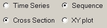
The X axis corresponds to the series, the Y axis to their value and
the lines with different colors correspond to a particular time step of
the simulation. The cases to plot, and the order in which the Variables
has to appear in the X axis, are set with a specific window.
It is possible to rank the series listed in the X axis according to
increasing
or decreasing values (at a certain time step), or to use the same rank
as appear in the Series Selected listbox. A label below the X axis
reports
the number of series used. The lines connect points from the different
series at the same time step.
Time Series & XY Plotting and more than one series
selected 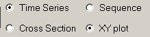
The X axis reports the values from the very first series in the window
Series
Selected. The graph will contain a line for each subsequent series,
placing a point for each value from the first series. For example,
suppose
there are three series in the Series Selected list (X1,
X2, and X3). The graph will contain two lines (or
groups of points) at the coordinates (X1t,X2t)
and (X1t,X3t), for each
time
step t included in the user's selection of cases.
The graph is produced by gnuplot (see here for details on how to manage
the windows produced by gnuplot).
Time Series & XY Plotting and one single series selected
This graph reports the phase diagram of a series. The X axes contain
values of the series selected, and on the Y axes are reported the
values
of future time. It is possible to insert a 45° line in the graph so
to indicate the stable points (where Xt=Xt+1).
The
user is requested to insert a lag value, and a single series will be
produced
for each lag. For example, consider the user requesting three lags. The
graph will contains two series at the coordinates (Xt,Xt+1)
and (Xt,Xt+2) respectively.
Cross Section & XY Plotting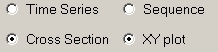
This graph considers data from a single time step. It uses the values
from a group of series for the X values and produces lines from
group(s)
of other series.
The user is asked to specify one single time step and how many series
will give the values for the X axis. It is necessary that the number of
series chosen for the X axis is an exact divisor of the rest of the
series.
For example, if the Series Selected list contains 6000 series,
the
user can choose 1000, 2000 or 3000 as "block length". If 2000 is chosen
(and k is the time step chosen) the system considers the values from
the
first 2000 series as values defining the X axis, and two other data
sets
(from the 2001 to 4000, and from 4001 to 6000) that will provide the Y
values to plot. The graph will therefore contain two lines defined by
the
2000 points each with coordinates {(X1k,X2001k),
(X2k,X2002k), ..., (X2000k,X4000k)}
for the first series and {(X1k,X4001k),
(X2k,X4002k), ..., (X2000k,X6000k)}
for the second.
Print Data
This
button prints in the Log window the data from the series selected. The
data are organized in columns with headers indicating the names of
the series. The data comprise the time steps indicated in the fiedls for initial and ending cases.
Lattice
Lsd permits to plot 2D lattices, where each square is colored according
to different values of a n x m series of data. The data must be defined
in positive integer values (including 0) .
The Series Selected listbox must contain all the data for the
lattice at the same time step, ranked by line. When asking for a
lattice
the system opens the following window:
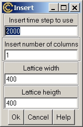
- Insert time step to use : insert the time step when the
data
must
be used. By default the window reports the latest time step available
for
the data
- Insert number of columns : the system requires to know
the
length
of the lines in the lattice. For example, if the number of columns is
40,
then the 41st series is considered to be the first value of the second
line.
- Lattice width : width of the lattice plot, expressed in
screen pixels
- Lattice height : heigth of the lattice plot, expressed
in
screen
pixels
If the option grid is set on, the plot will draw lines separating the
elements
in the lattice.
Note that if the total number of series selected divided by the number
of columns does not make an integer number, then the lattice plotting
is
aborted.
Gnuplot
Gnuplot is a package, distributed
freely,
for creating graphical representations of numerical series. It is a
very
powerful and flexible tool, which is frequently installed by default in
Unix systems. For Windows is available wgnuplot,
which is included in the Lsd distribution. Gnuplot
can be run from the operative system or launched from its menu entry in
the main Analysis of Result window, normally to
operate
on a file created with the Save Data command
(remember
to place a # before the labels' line).
Lsd uses gnuplot automatically to
create
the XY graphs (see plot for further details). It
is
a three steps procedure:
- create a data file and a command file with the data to use and
the gnuplot
commands for the desired graph; these files are located in a
subdirectory
of the model's own directory named plotxy_n, where n is the graph
number
reported in the Graph listbox.
- execute gnuplot's commands
resulting
in graph
with a format suitable to be imported in Tcl/Tk, the graphical language
used by Lsd.
- create a standard Lsd windows for a graph importing the gnuplot
generated graph.
Step 3 may be dangerous for Windows OS's. In fact, Tcl/Tk is likely to
crash when a too large graph is created (and all of your simulation
results
are lost...). To avoid this a control asks users whether to skip step 3
in case the graph appears too large (> 0.5 Mb). Instead of creating
the
Lsd internal windows, it is possible to generate a gnuplot
graph window, which is not related to the Lsd program. Such windows
need
to be closed explicitly, which is done by using a small windows created
together with the main gnuplot graphs
window.
gnuplot offers a wide set of options,
and Lsd exploits only a small part of these. However, it is possible to
edit the options used to create XY graphs and make them appear in the
Lsd
windows. See here how to do this.
Users willing to create sophisticated graphs, beyond the Lsd
possibilities,
can save the necessary data using the Save Data
command.
Then, run gnuplot (wgnuplot
for Windows users) from menu Help and exploit all the gnuplot
possibilities (see the gnuplot
extensive
help typing "help" in the gnuplot
editor).
Gnuplot options
These
options concern the terminal defined in gnuplot. The system
automatically recognizes the operative system used, and set the values
accordingly, although in some cases (e.g. Mac OS) there may be
different alternatives. Normally, MS Windows users should use the
"windows" terminal, while Linux and Mac users should use "x11".
However, Mac users can also use "aqua".
The second option concern the level of detail used by gnuplot for the 3D graphs. For details see the gnuplot help for "dgrid3d".
XY Plotting and Gnuplot (for expert
users)
The XY plots are generated using the gnuplot package (wgnuplot for
Windows). Gnuplot is used in batch mode. That is, Lsd prepares the
files
with the data ("data.gp") and with the commands for gnuplot
("gnuplot.lsd").
The resulting graph ("plot.file") is exported in the terminal tkcanvas
and
then sourced in the Lsd own Tcl/Tk interpreter. The files generated for
this process are kept on the disk up to the closing of the
Analysis
of Result module, during which they are removed. Users may exploit
these
files to run gnuplot interactively, for example generating XYZ plots,
errorbars
etc. For this purpose Lsd generates also a gnuplot command file
("gnuplot.gp")
that contains the same commands for the plot without the instructions
for
generating a tkcanvas.
Users may customize the gnuplot graphs by acting directly on the
commands
to gnuplot. To do this use the following steps:
- Create a graph using the desired series with the XY Plot option
on. This will store the data for the graph in the file 'data.gp'
located
in a directory called plotxy_N, where N is the plot number,
descending
from the model directory. See the Model Info in
LMM to know the model directory. The file gnuplot.gp will
contain
the gnuplot commands.
- Close the window containing the generated plot.
- Open with an editor (e.g. LMM itself) the file gnuplot.gp.
- Edit and save the file gnuplot.gp. For example, add a
line
stating set
nokey and save.
- Double-click on the item in Graphs corresponding on the
deleted
graph,
The system will generate a new gnuplot graph applying the edited
commands,
in the example above will use the same options but will not print the
legend.
Note that the graphs exported from gnuplot to Tk tend to be pretty
large.
Before loading them Lsd scans these files (reaching even tens of Mb's)
and removes the duplications, leaving manageable files of few tens of
Kb's.
Lines / Points
This option allows users to create graph with lines or points. Note
that for graphs using a large number of values the lines can be just an
approximation of the positions of the actual values.
Point size
For graphs produced by gnuplot determines the size of points. 1 is
normal size.
Color
By default the graphs created with Plot assign differen colors
to each series. Checking this options all series are plotted in black.
Users can still identify each series when no color is used by using the
mouse sensitivity features of the graph windows.
Grids
This option set on causes the graphs to be plotted with a grid dividing
the space in sections of 25% each, both on the vertical and horizontal
dimension.
Selection of Cases for "Cross Section"
Analysis
When the option "Cross Section" is checked on
(but in the case of XY plots), this function allows to decide the
cases,
i.e. the time steps, to consider as single series. It applies both for
plots
(where one line indicates a time step over all the Variables selected)
or for statistics, taken over the Variables
selected
at a given time.
The window below asks users the list of cases to be considered, to
be typed and added to a list, and then the sorting.
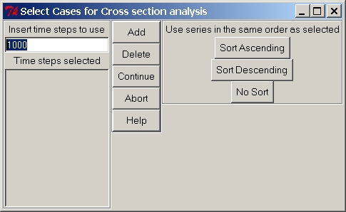
The leftmost section of the window contains the entry where to type
the cases to use. Below the entry there is the list of cases already
selected.
The central part contains four buttons:
- Add: include the typed case in the list of time steps
selected.
It is equivalent to pressing the key Enter.
- Delete: remove from the list of time steps the elements
currently
highlighted
- Continue: end the insertion of cases and continue the
operation
of plotting, or making statistics on, the cases selected (short cut: c).
- Abort: abort the operation, returning to the main
Anlysis of
Result
window
The rightmost section concerns the sorting of the Variables, to appear
as the X axis on the cross section graph (it is ignored for the
statistics
command). It contains a label indicating the option currently chosen,
which
changes when pressing one of the three buttons:
- Sorting Ascending: the Variables will appear according
to
their
increasing values at the time highlighted in the list of Time Steps
selected
when the button is pressed. That is, the Variable with the lowest value
at the time indicated will appear on the left of the graph, while the
Variable
with the highest value at the same time step will appear on the right
of
the graph.
- Sorting Descending: the Variables will appear according
to
their
decreasing values at the time highlighted in the list of Time Steps
selected
when the button is pressed. That is, the Variable with the highest
value
at the time indicated will appear on the left of the graph, while the
Variable
with the lowest value at the same time step will appear on the right of
the graph.
- No sort: the order of the Variables will be the same
used in
the
list of Vars. to Plot.
In case you want to insert a sequence of times, to generate many
series, there are several shortcuts:
- Control-f (for from). The value indicated will be
used as the first time step to insert.
- Control-t (for to). The value indicated will be
used as the last time step to insert.
- Control-x . The value
indicated will be used as step of the series. For example, starting
from 2 and setting step 3 you will insert 2-5-8-11-14 etc, until the
value indicated for final time.
- Control-z . Insert the
series as defined. If no step value have been indicated it will use
step 1.
Button "Save Data"
This command exports variable values from the Series Selected window
in a text file made of as many columns as the Variables chosen and as
many
lines as the cases indicated with the Cases to use
option. Two types of data files are available:
- Lsd Result Files: file contains data that can be loaded
in a
new
session of Analysis of Result in Lsd
- Text Files: file contains data in a generalized format
Many options are available for the the case of text files.
Labels to use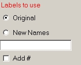
The option "Original" leaves the same series name as in the Lsd model,
attaching a progressive number to distinguish between different
instances
of the same series. This options can cause problems when Variables have
long names and the packages meant to be used for the data treatment
accepts
only few characters (e.g. SPSS and Statistica use only up to 8
characters
for variables names). The option New Names allows users to
assign
a name that replaces the original name of the variable, and the system
assigns a progressive number to distinguish between the different
variables.
For example, if the new name assigned is "Col", the series will be
indicated
by Col1, Col2 etc.
Users can add a '#' symbol before the first line indicating the
Variable's
labels. This is the standard for files accepted by gnuplot
which ignores the columns' headers.
Columns delimiter 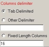
Three options are available. The default is the standard Tab delimited
file, where the column are separated by the tab character (accepted by
most packages). The second option allows users to specify their own
delimiter
for columns (e.g. semicolon, spaces etc.). The last option allows users
to create fixed length columns. This means that each column will
contain
exactly the spaces indicated. For variables labels (first line) the
possible
extra spaces are filled with spaces, while for the values are filled
trailing
decimal zeros.
General Options 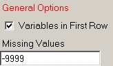
Lastly, users can decide whether to have variables labels in the first
row of the file (some packages don't accept data mixed with labels). In
case there are missing data, users can specify the code for missing
values.
Button "Statistics"
This button causes Lsd to compute few descriptive statistics on the
variables' values selected in Vars. To Plot listbox. Depending on the
options
chosen, the statistics can be computed on all cases for each variable (Time
Series) or single cases for all variables (Cross Section).
Moreover,
in case of time series statistics, the statistics are computed only on
the cases set with the option for X self scaling.
The statistics appear in the log
window (from which can are copied and pasted elsewhere). The
indicators
provided are:
- average;
- variance;
- minimum
- maximum
- standard deviation
The statistics are reported on lines containing, for time series
statistics,
a line for each variable and the number of cases considered:
Time series Descriptive Stats.
400
Cases
Average Var. Min Max Sigma
InstallBase 1_10 (400) 161.855 8811.14 0 251
93.9852
InstallBase 1_18 (349) 107.845 1523.25 0 131
39.0849
InstallBase 1_101 (26) 0.884615 0.102071 0
1
0.325813
The header indicates the number of cases considered in all. But, if
the Variable lasted only few time steps, the statistics are computed
only
over the actual time steps it lasted. These are indicated in between
parenthesis
after the name and code of the Variable. In the example the first line
concern a Variable lasting for all the 400 cases. Instead, the second
and
third Variable have lasted for 349 and 26 cases respectively.
For cross section statistics, each line refers to a time step and
reports
the statistics over the Variables considered. Again, the computation
consider
only the periods of existence for the Variables:
Cross Section Descriptive Stats.
3 Variables
Average Var. Min Max Sigma
Case 50
(1)
8 0 8
8
0
Case 100
(2)
60 169 47 73 18.3848
Case 370 (3)
7.667 10422.2 1 251 125.033
In the example above the statistics requested concern three
Variables
and three time steps, 50, 100 and 370. In between parenthesis is
reported
how many Variables existed in each case (1, 2 and 3).
Menu "Exit"
Exits the Analysis of Result and return to the Lsd Browser window or
to the Debugger window. All graphs are lost when the module Analysis of
Results is closed.
Option "Time Series" or "Cross Section"
This option allows to consider plots and statistics
as time series or cross section analysis. In the Time Series
case
the data used are all the values in the range of
cases
specified
by the user (automatically excluding missing values) and the analysis
consider
a data set as the values produced by one Variable across the time
steps.
In the Cross Section case the user is requested to specify one
or
more time steps (series including missing values at that time step are
automatically excluded). In this case a data set is given by the values
of different Variables at the same time step.
For plotting graphs the results depend also on the option Sequence
/ XY Plot (see here). See help on plot
for further details.
Option "Sequence / XY Plots"
This option allows to consider alternatively plots
of a sequence of values or as a XY mapping. The case of Sequence
consider each data set as identical to the others. Instead, the case of
XY
Plots consider one data set as to be placed on the X axis of the
graph
and the other(s) to be plotted as corresponding Y's.
The actual type of graph depends also on the option Time Series
/ Cross Section (see above or on
help
on plot for further details).
In the following is discussed the case of XY Plots.
- In case of Time Series the X axis will be occupied by the
values
of the very first entry in the list of the Series Selected. and
the graph will consider as separate data sets any other series. For
example,
suppose there are three series in the Series Selected list, X1,
X2, and X3 The graph will contain two lines (or
groups
of points) at the coordinates (X1t,X2t)
and (X1t,X3t), for each
time
step t included in the user's selection of cases.
- In case of Cross Section, the user will be asked to
specify one
single time step and how many series will give the values for the X
axis.
It is necessary that the number of series chosen for the X axis is an
exact
divisor of the rest of the series. For example, if the Series
Selected
list contains 6000 series, the user can choose 1000, 2000 or 3000 as
"block
length". If 2000 is chosen (and k is the time step chosen) the system
considers
the values from the first 2000 series as values defining the X axis,
and
two other data sets (from the 2001 to 4000, and from 4001 to 6000) that
will provide the Y values to plot. The graph will therefore contain two
lines defined by the 2000 points with coordinates {(X1k,X2001k),
(X2k,X2002k), ..., (X2000k,X4000k)}
for the first series and {(X1k,X4001k),
(X2k,X4002k), ..., (X2000k,X6000k)}
for the second.
Note that the XY graphs are not generated by Lsd directly but are
imported
from gnuplot, a graphical package. Only few of the options
offered
by gnuplot are exploited in the Lsd Analysis of Result options.
See the instructions
to apply different gnuplot
commands to your Lsd graphs.
Button "Postscript"
This function allows to save a graph as postcript file, which is a
standard format for graphical pictures. These files can be printed (to
postcript printers) or included in documents.
Users are requested to specify which graph they want to save, by
selecting
one in the Graphs list. The following options are available:
- Include graph labels: include in the file the labels for
the
series.
- Color or Gray: produces a color or gray shades postcript
file
- Landscape or Portrai: produces a horizontal- or
vertical-riented
postscript file
- Dimension: allows users to define the width (in
millimeters)
of
the picture in the postcript file
- filename: choose the file name for the picture
- Choose file: allows users to modify the name of the file
and
its
directory
Graph Windows
The graphs produced during a Analysis of Result session are
listed in the right-most list in the main Analysis
of Results window. They are independent windows that are destroyed
once the Analysis of Result session is closed. Graph windows
can
be removed by clicking with the right button of the mouse in the Graphs
listbox in the main window, or selecting it and pressing the Delete
key.
The plots produced with the commands Plot are
endowed
with a series of features that semplify their use and reading (some of
these features are not available for graphs produced using the XY
Plot option on). Of course, windows produced by gnuplot
do not share such features.
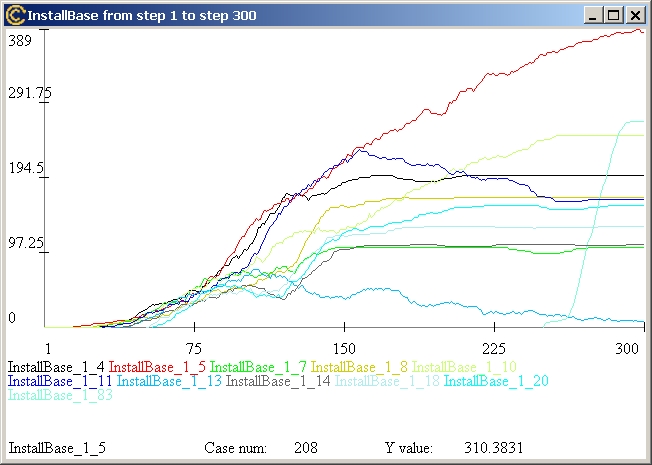
The example above is a (time series) plot where the series have been
selected as the only Objects surviving at a given time (using the
option
Sort
(end) ), with colors and no grids.
These windows are sensitive to the mouse passing over them: the bottom
part of the window prints the series over which the mouse is positioned
(InstallBase 1_5 in the example), the
X value
(Case num: 208) and the Y value (Y
value: 310.3831). This sensitivity permits to read a graph
containing very many series, even when using the
no color
option.
Graphs can be improved adding new labels and modifying existing
ones:
- Click and drag one of the existing label moves them
around
the graphs;
- Click the right button of the mouse over one label to
edit
its text,
dimension, font and color.
- Press the Shift key and Click to create a new label;
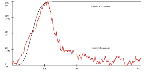
With this option it is possible to create fancy
graphs. In the following example a two-scales graphs enjoys edited
labels,
repositioned and recolored.
Frequently a user produces quite many graphs, and the screen becomes
easily crowded of graphs. To move easibly among the graph windows the
user
can exploit two features:
- double-clicking on the label of one graph the listbox Graphs
in
main Analysis of Result control window brings that graph in the
foreground.
- double-clicking on a graphs window brings the main Analysis
of
Result
control windows in the foreground.
Menu Help
This menu offers three elements
- Analysis of Results - Help. Show this help page
- Model Report show the model report, containing model
structure.
See the help
on the model report.
- Model Help show the model help, containing the
modeller's
comment
on the model. See the help
on the model
help.
Menu Color
Users can set personal colors to use for the first 20 series
(subsequent
series are plotted in black). Choosing the menu entry "Set colors" a
new
window shows the colors currently used. Click on one of the colors to
modify
it. Only the graphs produced after the color change are affected.
Choose "Default colors" to reset the initial colors.
Batch Selection
When users need to select many series in the listboxes Series Available and Series Selected it is possible to
click on one label with the right button of the mouse in order to use a
general criterion to operate with a whole set of series with that
label. In the example below the mouse was clicked with the right button
of the mouse on the label HerfEval.
There are three possible criteria:
- Select all the series:
select all the series with the chosen label.
- Select for series' tags:
series are associated with tags containing as many numbers as the
hierachy of objects containing them. In the example, the variable HerfEval is located in an object in
the third hierarchical level, and therefore you need two digits to
indicate the exact copy of the object containing it: one for the second
layer and one for the third layer (the first layer is Root which is present with only one
copy). Choosing this criterion, the user can place one value in one of
the cells (only one) and the system will select all the series
respecting the condition in respect of the indicated number in the
tag's position indicated by the cell.
- Select for values of another
series: it is possible to select the series in respect of the
values that another series in the same object takes at a given time
step. The user needs to indicate the label of the other series, the
time step to be used, and the value to be used for comparison. The
condition indicates the criterion by which to compare the value of the
selecting series.
Inserting no values in the cells the system will add all the copies
of the label ("numLinkA" in the example) in the Series
Selected listbox. Inserting one value, the system will insert only
the copies having the inserted value in the position of the cell used.
Cross-section Scatter plots
This option is activated when the user selects Cross-Section in the Time Series/Cross-section option and XY-graphs in the Sequence/XY-graph
option and press the button Plot.
The graph generated will be a scatter plot built with points composed
from data in the series selected at a specific time. That is, from each
series selected the system extracts one value at the specified time.
The graph can be composed by points or line as indicated by the option
on the main Analysis of Results window. These values are re-arreanged
to generated 2 or more variables: one or two independent ones (for 2D
or 3D graphs respectively), and one or more dependent ones.
Users
need to provide the number of series that must be plotted, which depend
on the number of series selected (call it M), the number of indepedent
series (say N) and whether the graph will be 2D or 3D.
The
series selected are considered sequentially, according to the order
used in the Series Selected listbox. The M series used will be divided
in N+1, for 2D graphs or N+2 blocks containing an identical number of
series. The first block (for 2D) or the first two (for 3D) will be
considered the values for the independent variable(s), used for the
horizontal axis or plane. The remaing series will be the dependent
ones, appearing on the vertical axis.
For example, suppose you
selected 120 series. If N=2, that is, there are two dependent series to
plot, if you choose a 2D each variable in the graph will contain 40
points. If you select a 3D graph each variable in the graph will
contain 30 points.
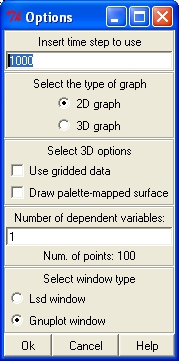
The user must provide the following information:
Time step:
Time step of the values to extract from the series selected. Series
whose initial and final time of existence is 0 (conventional values
indicatating that the series is actually composed by a single value)
will always used that value, irrrespective of the time step indicated.
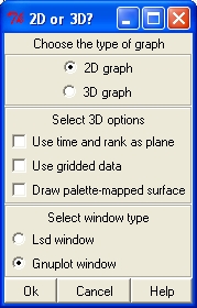
2D or 3D: generate a plot in 2 or 3 dimensions.
3D options:
For 3D graphs only gnuplot offers the possibility to use "gridded"
data. Instead of considering the actual values, gnuplot will divide the
plane of the independent variables in equally spaced squares,
interpolating the values in those squares. In case of gridded data it
is possible to replace the lines or points with a colored surface.
Number of independent variables:
the user must indicate how many dependent variables must appear in
the graph, generating as many lines (or surfaces) as a function of the
independent ones.
Num. of points:
for control only, the system indicates the number of points on the
independent variable (or plane) can be constructed with the options
indicated.
Window type:
the graph generated can be placed either into a normal Lsd graph
window, or as an external window managed by gnuplot. The latter has
normally better quality and many features (e.g. it is possible to
rotate 3D graphs), but cannot be exported as with the Lsd windows.
3D Time Series Graphs
This option is activated when the user selects Time Series in the Time Series/Cross-section option, XY-graphs in the Sequence/XY-graph
option, and 3 or more series appear in the Series
Selected listbox. and press the button Plot.
The graph will consider the first two series as independent variables
plotted on a horizontal plane and the subsequent series as
dependent variables plotted on the vertical axis. The user is requested
to choose between a 2D graph with multiple dependent variables or a 3D
graph with one or more independent variables. The same options as for
the Cross-Section 3D graphs apply.
The same options as for
the Cross-Section 3D graphs apply.
The additional option concern the possibility to generate 3D graphs
using the time as one of the independent variables, while the first
series selected will be the other variable on the plane of the graph.
3D Graphs options
There a many ways to customize a 3D graph, giving the flexibility
offered by gnuplot. Unfortunately, they are less than obvious, and so
in this section we present how Lsd user can easily modify the
most relevant aspects of a 3D graph. The graphs appear in a window that
can be closed clicking on the button Ok
in a small window telling Click to
close.
Lsd generates surface graphs, either with a color or a gray scale, like
the one depicted below.
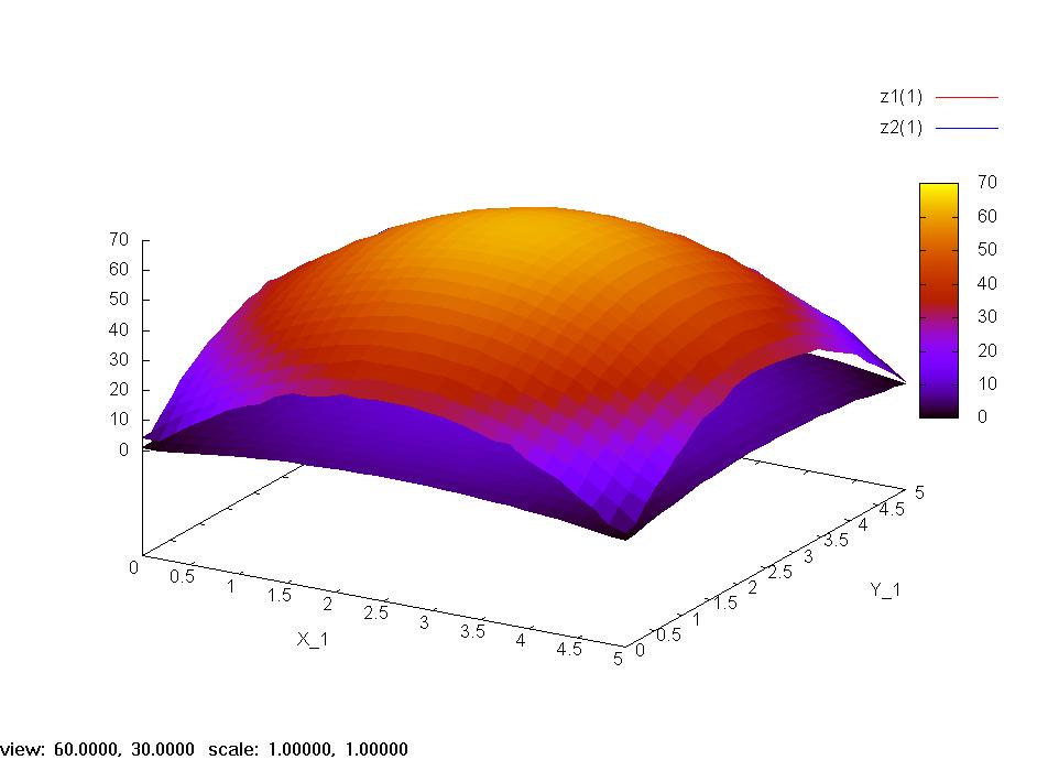
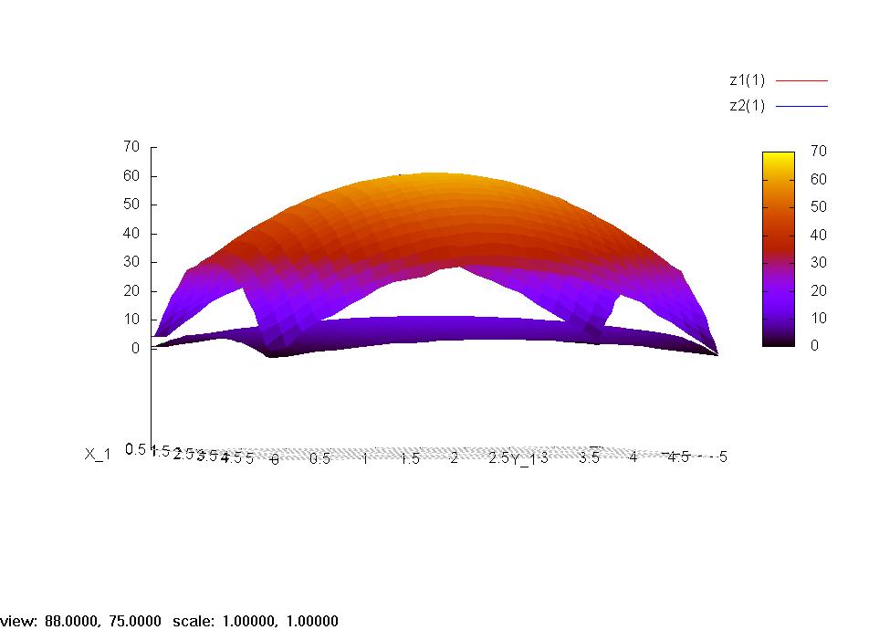
Such image can be rotated by clicking with the main button of the mouse
and moving it across the image. For example, you can immediately
observe the next image.
In order to export such graphs there is not, unfortunately, a direct
way. You need to click with the mouse over the bar topping the window
containing the graph. From there choose the option to Copy to clipboard the image. Then
you can past the image in a graphical package, for exampe Paint in Windows (menu Accessories),
and save the image with your preferred format.
In order to access more sophisticated options you need to know how Lsd
uses gnuplot. When a gnuplot graph needs to be produced, Lsd generates
a new directory and places there several files. One file is called data.gp, containing the values
used for the graph. The other two files gnuplot.gpand gnuplot.lsd, contain the
commands to gnuplot in order to elaborate the data. Lsd generates a new
graph anytime you double click on the name of the graph using the
commands contained in gnuplot.gp.
Therefore, in order to generate a modified 3D graph you need to:
- Generate the graph with the default options.
- Close the newly generated window with the graph.
- Opening the file gnuplot.gp
with any text editor (for example, with LMM), considering that the
directory containing it is called plotxy_N
where N is the number of
graph.
- Edit the gnuplot.gp
file
- Double-click on the name of the graph in the Graph listbox in the main Analysis of Result window of Lsd.
Here are the options available:
- set xlabel :
determines the label for the X axis. The same command works for the ylabel and zlabel.
- set dgrid3d 30,30,4
: this command determines the definition of the graph. The first two
values (30,30 by default) indicate the number of segments used on the X
and Y axis. The higher this number the more precise is the graph (and
the heavier is the memory requirements). The third value (4 by default)
indicates the approximation for the Z values. The higher the closer.
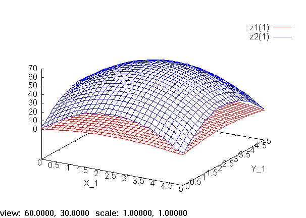
- set pm3d : draws a
surface connecting the points of the series. This is set by default.
Removing this line you generate a graph made only of lines or dots (as
indicated in the option Lines/Points in
the main Analysis of Results
window. For example, using the Lines
option you would obtain:
- set palette gray
or set palette color
: generate the surface in gray shades or colors (only if the option set pm3d is present).
- set grid :
uses a grid for the plane X-Y
After all the options have been given, there is the main command to
plot the series. The command indicates the file name from which to take
the data, the columns to use, and other options. For example, in order
to plot the two series in the example graphs the command is:
splot 'data.gp' using 1:2:3 with
lines t "z1(1)", 'data.gp' using 1:2:4 with lines t "z2(1)"
where:
- splot: is the
command for a 3D graph
- 'data.gp': is the
data file
- using 1:2:3 : is the
command sayng that the surface must use the data in columns 1 and 2 for
the independent variables, and 3 for the dependent variable.
- with lines :
indicates to use lines to connect the points. Alternatievely, one can
be points, or pm3d for the surface only (but,
in the case, you need the option set
pm3d).
- t "my tytle" :
indicates the title for the series. To omit the title set t
""
For further information on gnuplot, open an interactive console of
gnuplot by choosing it in the main Analysis
of Result window.